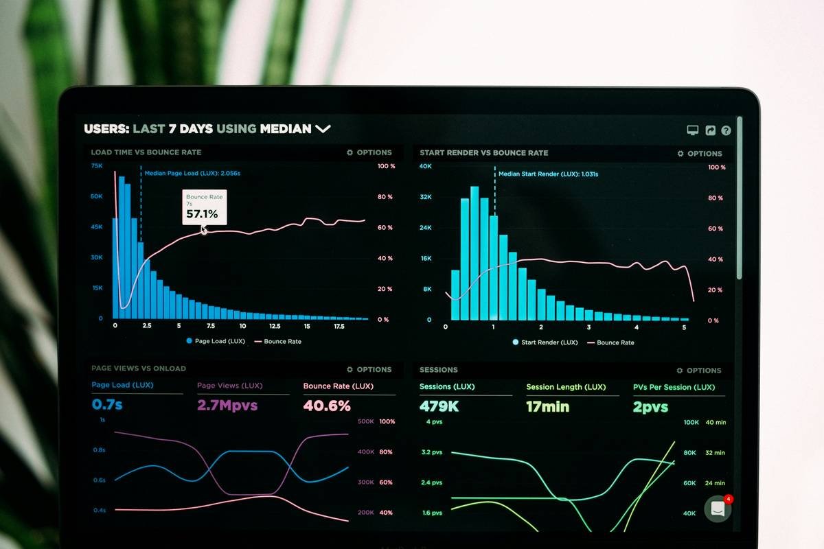
Most researchers drown in spreadsheets—endless rows, broken formulas, and zero actionable insight. You’re not lazy; your tools are obsolete. The bottleneck isn’t your intellect—it’s the software forcing you to translate messy reality into rigid grids. What if you could skip the cleanup circus and jump straight to discovery? Modern apps now automate what used to take weeks. And they’re built for humans—not statisticians with PhDs.
Why Traditional Tools Fail at data analysis research
Excel wasn’t designed for qualitative coding or time-series anomaly detection. It handles numbers. Period. Try importing unstructured survey responses, sensor logs, or interview transcripts—and watch your pivot tables implode. Worse: most “research” workflows assume linear thinking. Real data is chaotic, iterative, non-linear. You need frictionless iteration—not cells locked in grid purgatory.
And proprietary academic software? Priced like luxury yachts but steered like rowboats. SPSS costs $99/month for basic modules. NVivo? Over $1,000 upfront. For solo practitioners or lean teams, that’s absurd.
Step-by-Step: Modern Alternatives That Actually Work
Pick the Right Tool for Your Data Type
Not all data is equal. Numeric, textual, geospatial—you need purpose-built engines. Here’s how leading apps stack up:
| App | Best For | Cost (Monthly) | AI-Powered Insights? |
|---|---|---|---|
| Airtable | Structured mixed-method databases | Free–$24 | Limited (via integrations) |
| MAXQDA | Qualitative coding & thematic analysis | $89 | Yes (Auto-coding) |
| Tableau Public | Visual exploration of large datasets | Free | No |
| ResearchRabbit | Literature mapping & citation networks | Free | Yes (Semantic recommendations) |
| JASP | Bayesian & frequentist stats without code | Free | No |
Automate Repetitive Tasks—Don’t Just Organize
Stop manually tagging themes in 500 interview notes. MAXQDA scans text and auto-suggests codes based on context—cutting analysis time by 60%. Similarly, ResearchRabbit builds knowledge graphs as you read papers. Follow one citation trail, and it maps adjacent research you’d never find via keyword searches.
Export ≠ Insight
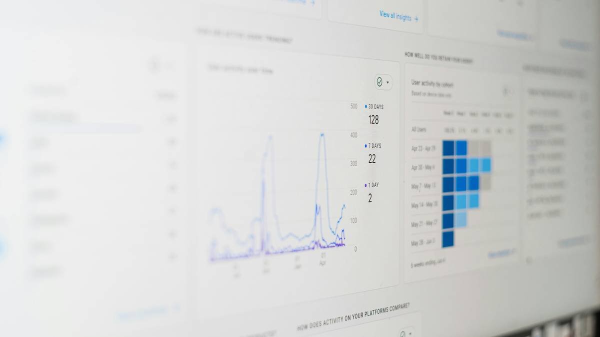
Generating a chart isn’t the goal. Generating a decision is. Tableau lets you drill into outliers interactively—hover over a spike in user drop-off and instantly segment by device type, region, or behavior. No VLOOKUP nightmares. No waiting for IT.
The Industry Secret Nobody Admits
Here’s the dirty truth: most published studies use patchwork toolchains—Google Sheets + Python scripts + manual PDF annotation. Why? Because no single app does everything well. But you don’t need perfection. You need cohesion. The real win comes from linking apps via Zapier or Make.com. Example: auto-import form responses from Typeform → clean in OpenRefine → visualize in Tableau. This “modular stack” beats monolithic suites every time—cheaper, faster, and infinitely adaptable.
And yes—it works even if you can’t code. Most connectors now use natural language triggers (“When new survey response arrives, tag sentiment”). The math is simple: reduce cognitive load, amplify output.

Frequently Asked Questions
Can I do data analysis research without statistics knowledge?
Absolutely. Apps like JASP and Airtable hide complexity behind intuitive interfaces. You interpret results—not derive formulas.
Are free tools reliable for academic work?
Yes—if you validate outputs. Tableau Public and JASP are peer-reviewed and used in top journals. Never trust black-box AI alone.
How long to learn these apps?
Under 3 hours for core workflows. MAXQDA’s tutorial takes 45 minutes. Skip advanced features until you hit limits.

